Hand Painted Murals, Decorative Letters & Custom Cards
Instead of the typical “Instagram Top 9” trend that happens at the end of every year, I decided to choose my favourite projects that I did in 2020 and not rely on the most likes I received to influence my choices. Looking back at these projects I accomplished makes me super grateful to have art as an outlet. Because I had extra time on my hands due to the COVID restrictions, I was able to hand paint 12 murals, from utility boxes to garages, to window murals,17 (if you include mini mailbox murals). I was also able to finally participate in 36 Days of Type, an international lettering challenge that forced me to create every single day.
#9 - make your own magic - toronto garage
This magical lettering mural marked my10th mural project ever which was super exciting for me. It's been a whirlwind getting into the world of muraling and just going with the flow. And so all the kind words and support I have received has been so heartwarming and especially helpful during those tough moments of painting when I wasn't feeling motivated or doubting my skills. Thanks so much to everyone following along my creative journey! Check out this project here.
#8 - tower of glass - utility box at King and shaw
Inspired by Toronto's historical homes and their timeless stained glass windows, I painted this vibrant and captivating modern-meets-traditional design in hopes that it will bring joy to whoever passes by! Check it out in person at King and Shaw or here. A special thank you to @start_streetartoronto for bringing public art to our streets of Toronto!
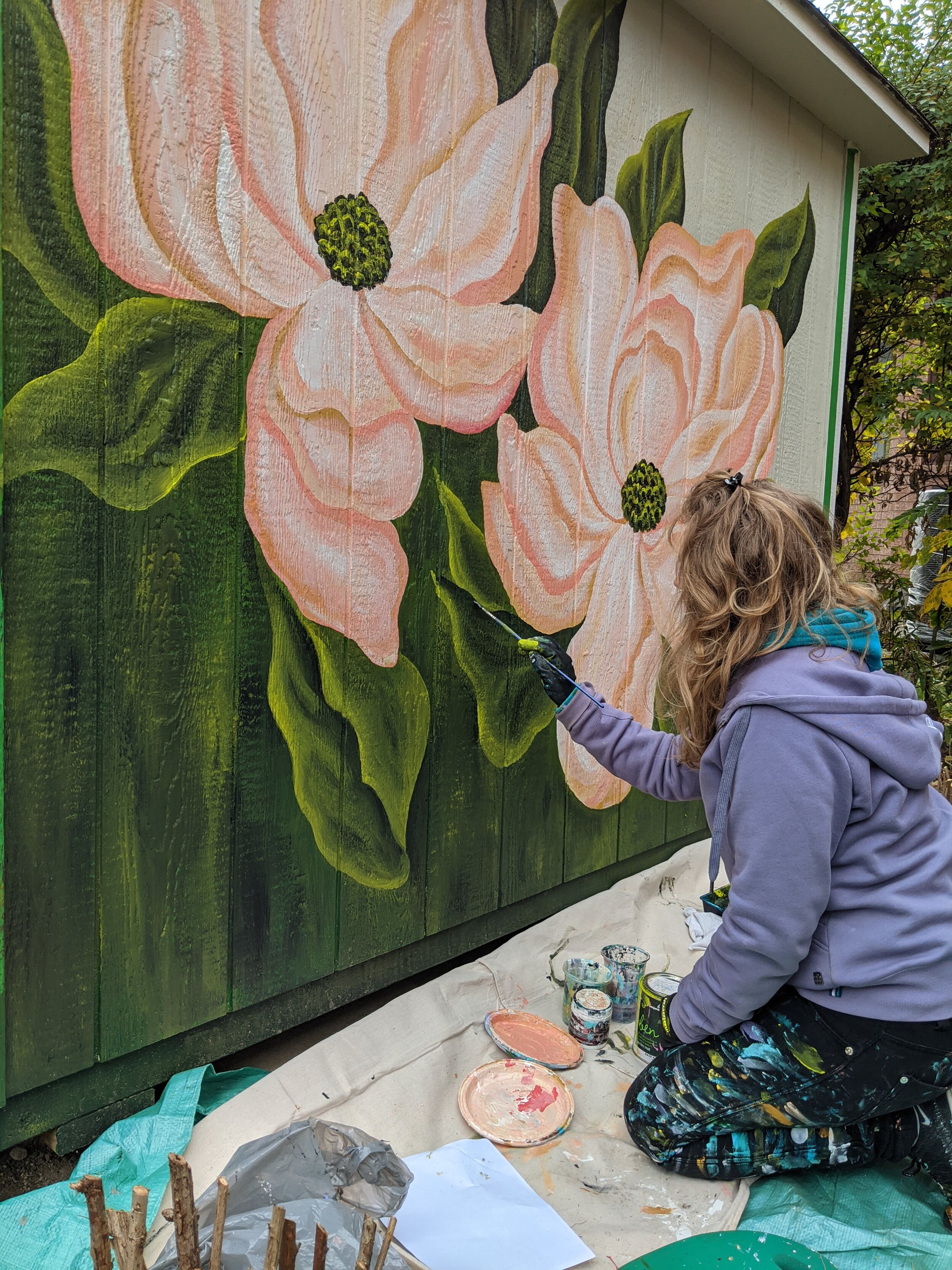
#7 - sweet magnolias - etobicoke shed
Grateful for my lovely parents who are slowly letting me transform their house and property with painted murals!!! They have always been my number 1 fans showing up with support, love, food, and endless cups of tea. No matter what my wild mind comes up with, they are usually on board with it, within reason haha. Check out this mural here.
#6 - butterfly’s paradise - etobicoke garage
A swallowtail butterfly's paradise - a garden of wildflowers was painted for the Neighbourhood Love project in South Etobicoke. This was a community-engaged art project that was initiated as a response to a bullying incident in the neighbourhood, resulting in 25 hand painted murals by 20 local artists. Check out this mural and the full story here.
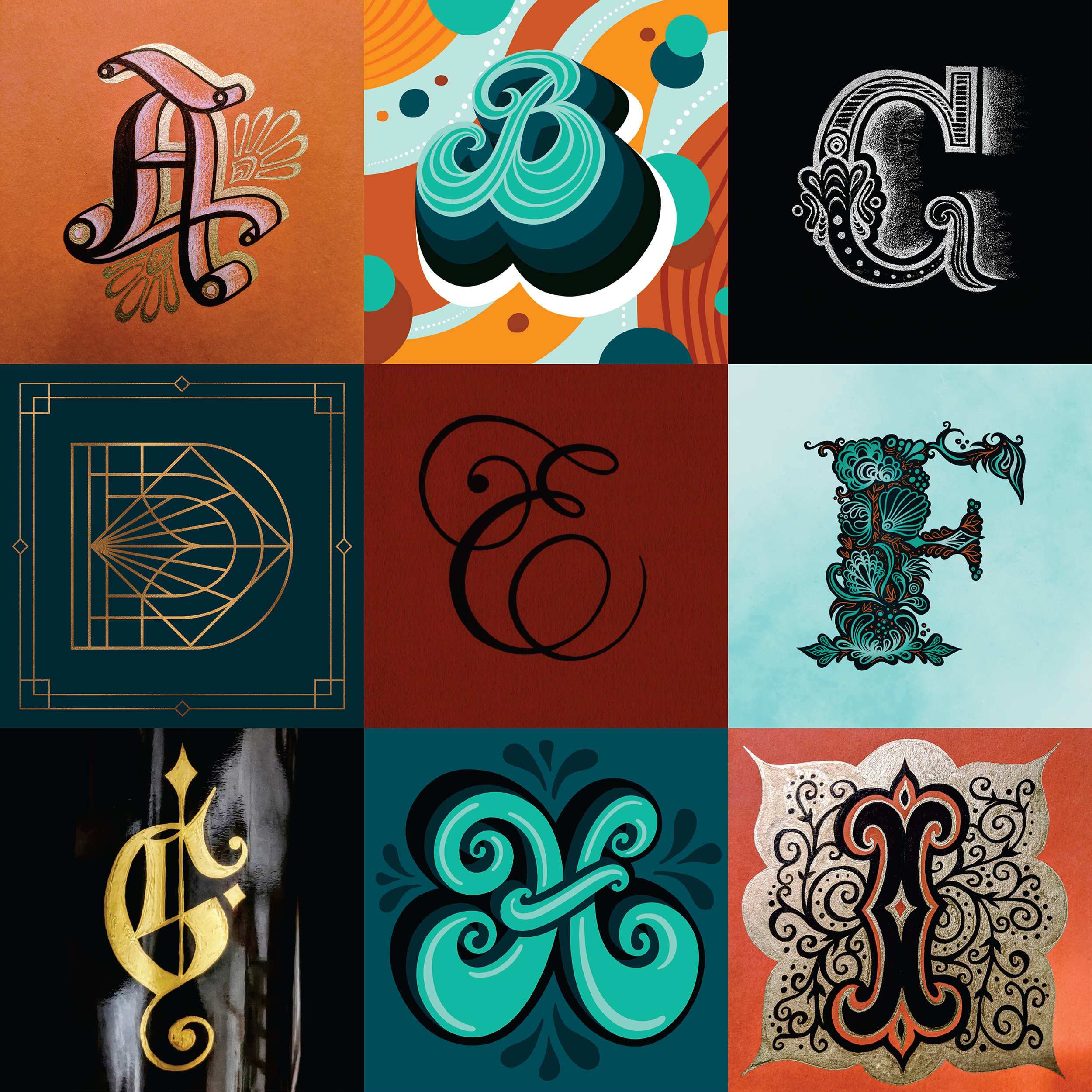
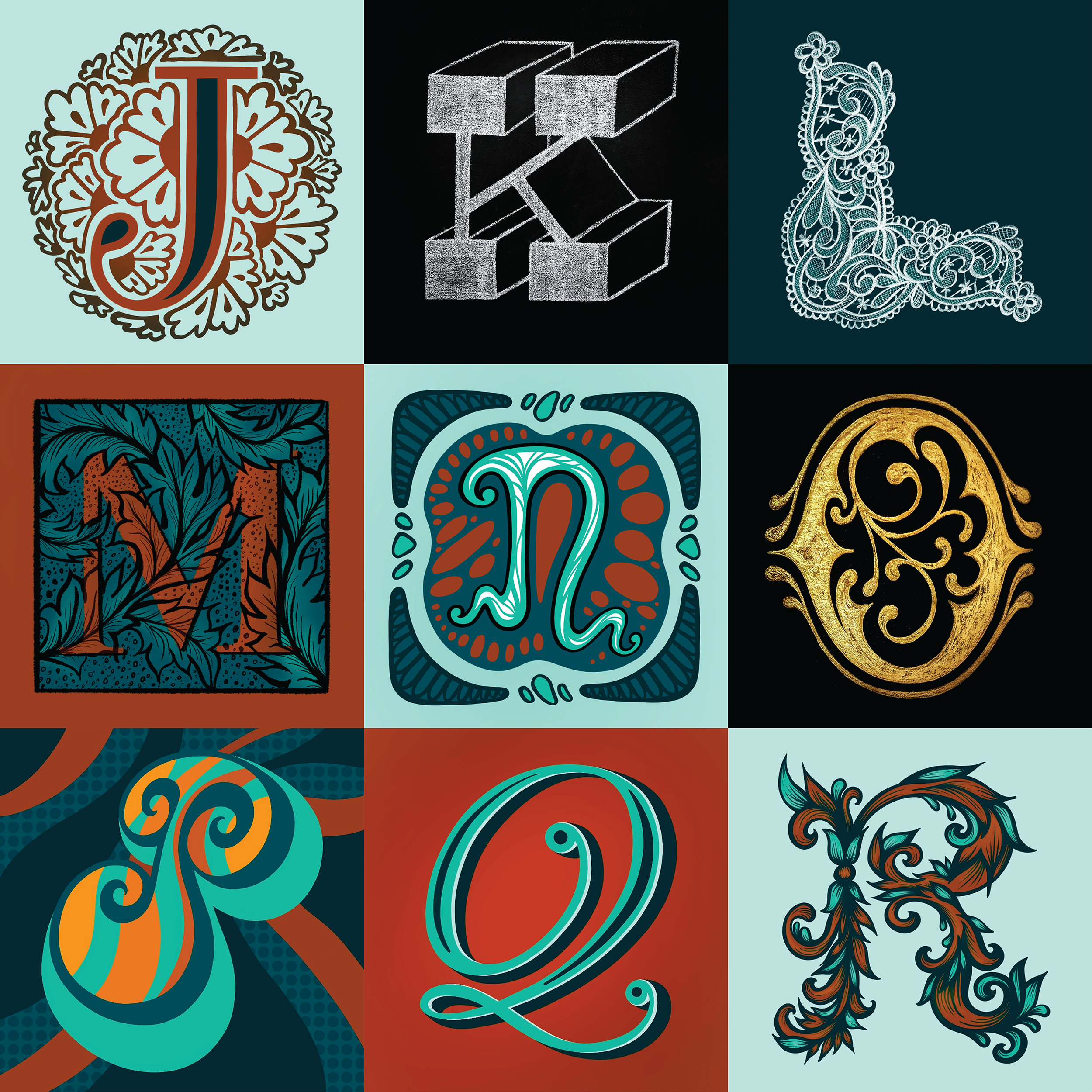
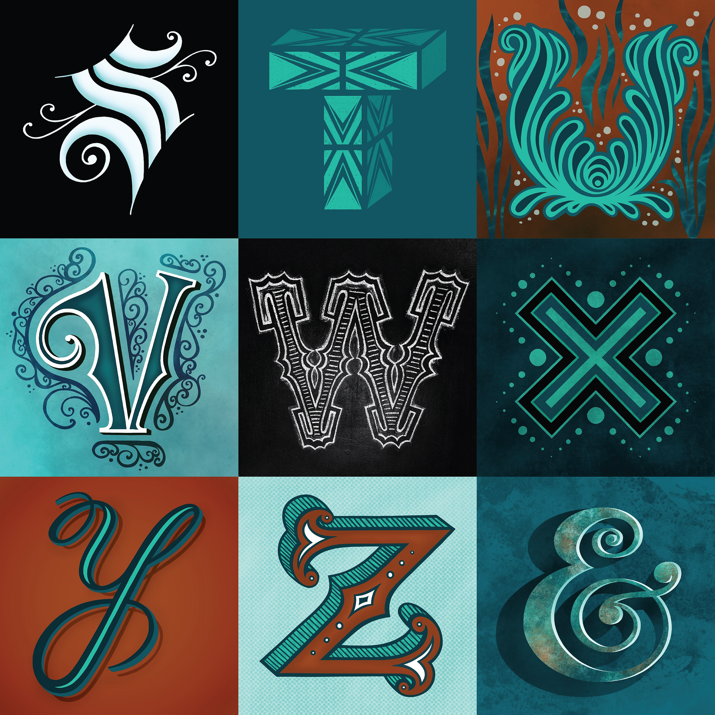
#5 - 36 days of type - a lettering challenge
I was super excited to participate in @36daysoftype, an international project that challenges artists, designers, and illustrators to create their own interpretation of the letters and numbers of the Latin alphabet. Every single day for 36 days. I really had fun with this challenge, creating a colour palette, themes, alliterations, and exploring different mediums. Check it out here.
#4 - it’s nice to have a friend - digital lettering greeting card
This folk flowered greeting card was inspired by my 100 year old jolly grandma and one of her famous sayings. During the difficult months of 2020, I have come to appreciate my relationships and friendships more and more. Friends who are like family and family who are like friends, either way it is quite nice. I sent out this card as a thoughtful gift to loved ones to say hello. Custom cards are available for sale on my Etsy shop here.
#3 - stairway to ocean - stairway mural
This is my contribution to the world's first stay-at-home environmental mural festival: HOME. Organized by international public art-meets-environmental organizations, the purpose of this project was to unite creatives around the world in order to give our planet an artistic voice. It was super cool to be one of 800 artists who signed up in 60 countries to paint a mural in their home. I choose my stairwell because why not? Together and still apart, we transformed drab white walls at our unique homes into visionary canvases for a brighter future. Check out the project here.
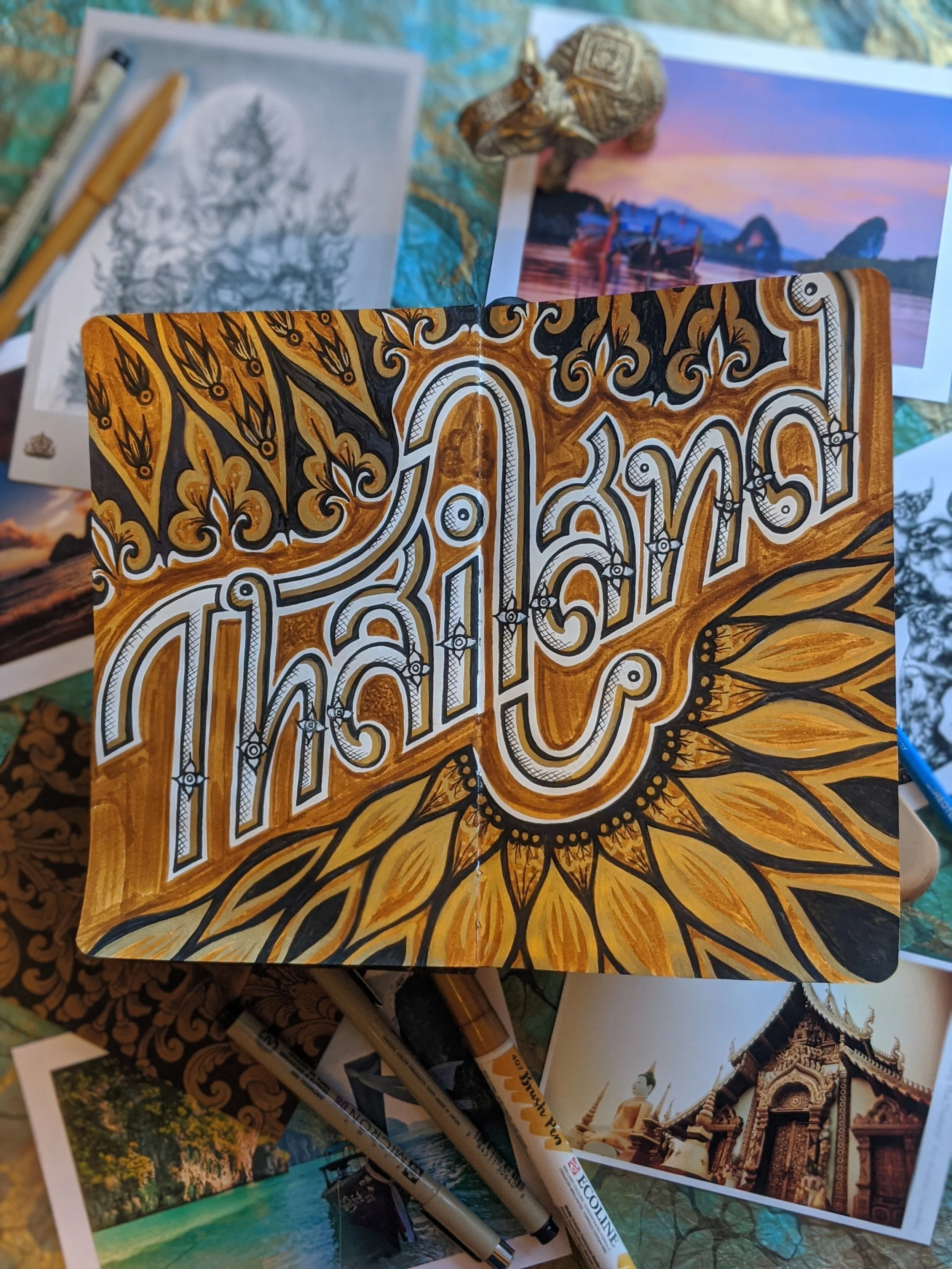
#2 - thailand - a unique journal entry
This piece was inspired by a daydream of warmer days in Thailand where the sun never stopped shining and everything was so green and so so GOLD. (I am referring to the temples of course) This piece pretty much sums up my feelings for this beautiful place I was fortunate enough to travel to in November 2019: so rich in culture, nature, and life. The lettering was inspired by Thai money aka Thai Baht, with the intricate details on their bills seen below.
#1 - julia prajza creates - personal magazine graphic
I have wanted to create a magazine cover-inspired design for awhile now and I thought there was no better time than the present to get playful with this fun portrait. I love the flexibility of wearing different hats everyday and seeing where my creative journey takes me. One day I'm a muralist hand painting a garage and the next day I'm designing the digital artwork for a music composer. Who knows what this cover will look like in 2022?
If you made it all the way to the end, thanks for reading and cheers to a more colourful year in 2021.


